
Back to the table

Artist sites for Universal Music Group

30+ sites where a fan should feel at home in the first few seconds, on a phone.

Client
Universal Music Group, through Halo Media
Role
Product Designer, usually the only designer
Years
2022–2026
Scope
Art direction, UX and UI, from first idea to developer handoff
Artists
The Bee Gees, Karol G, Zayn, 5 Seconds of Summer, beabadoobee, Remi Wolf, Coco Jones, Tierra Whack, and more
2022–26
30+ sites
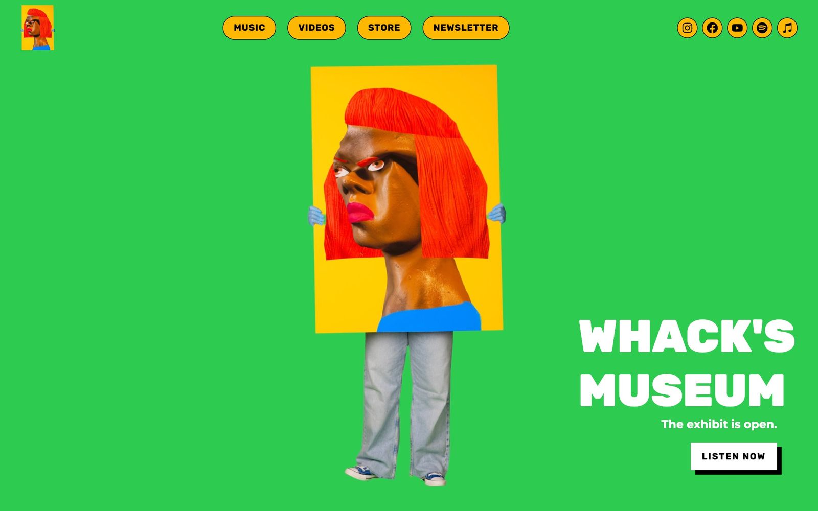
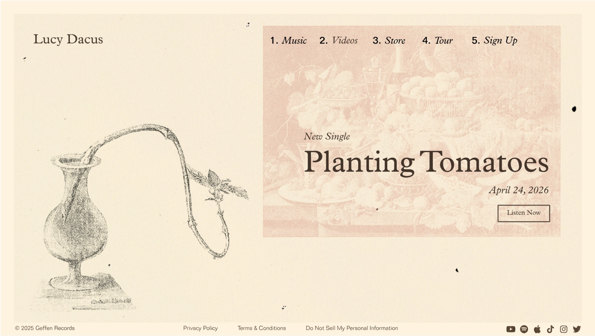
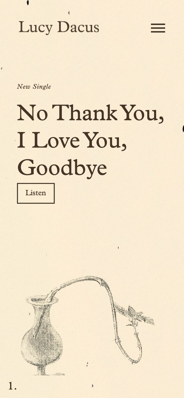
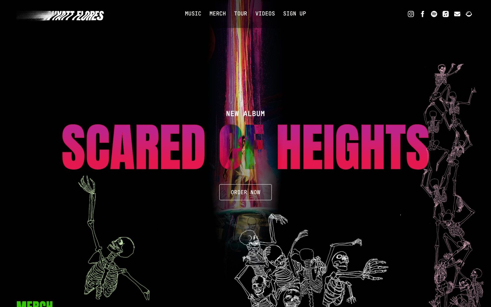
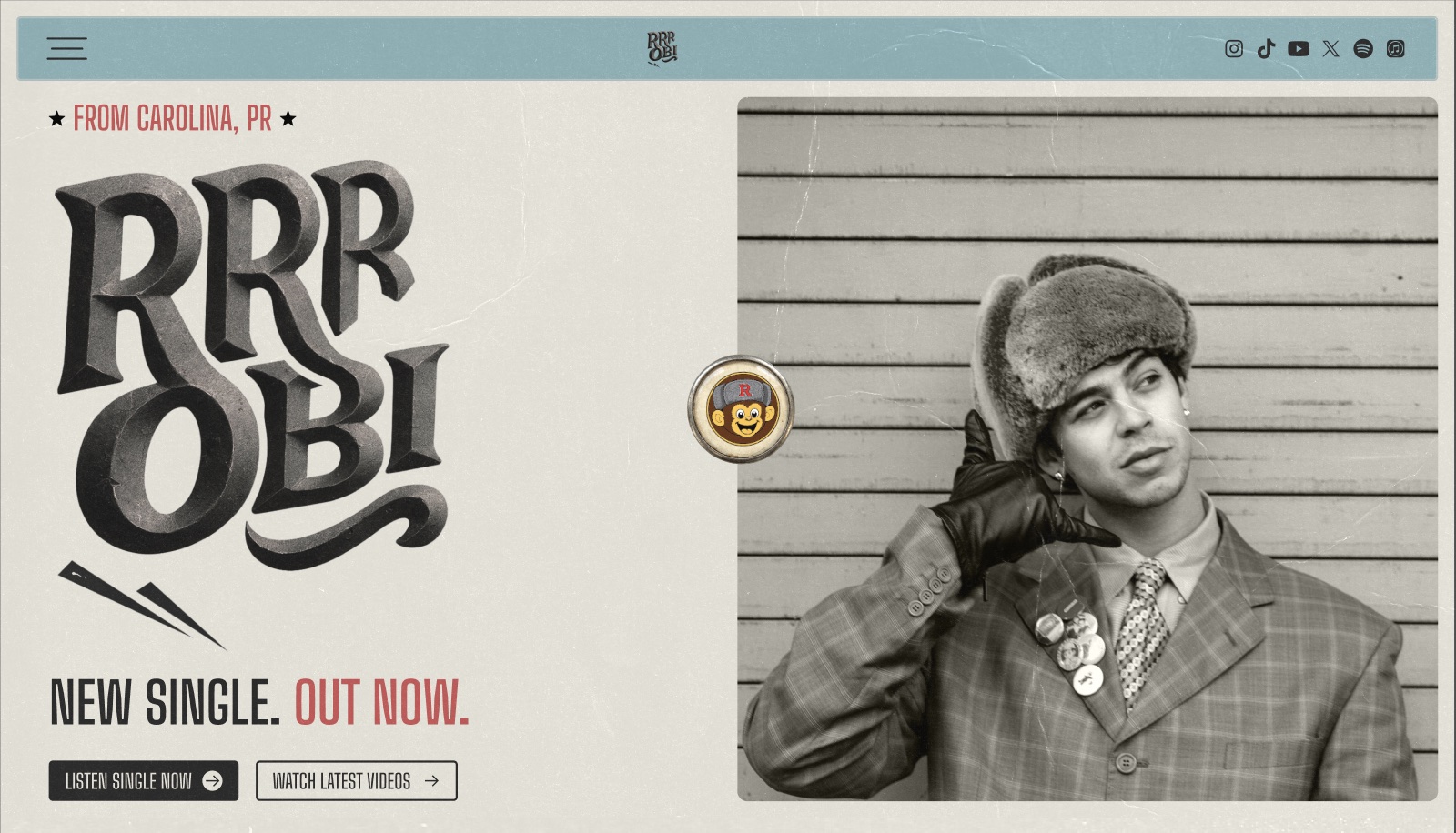
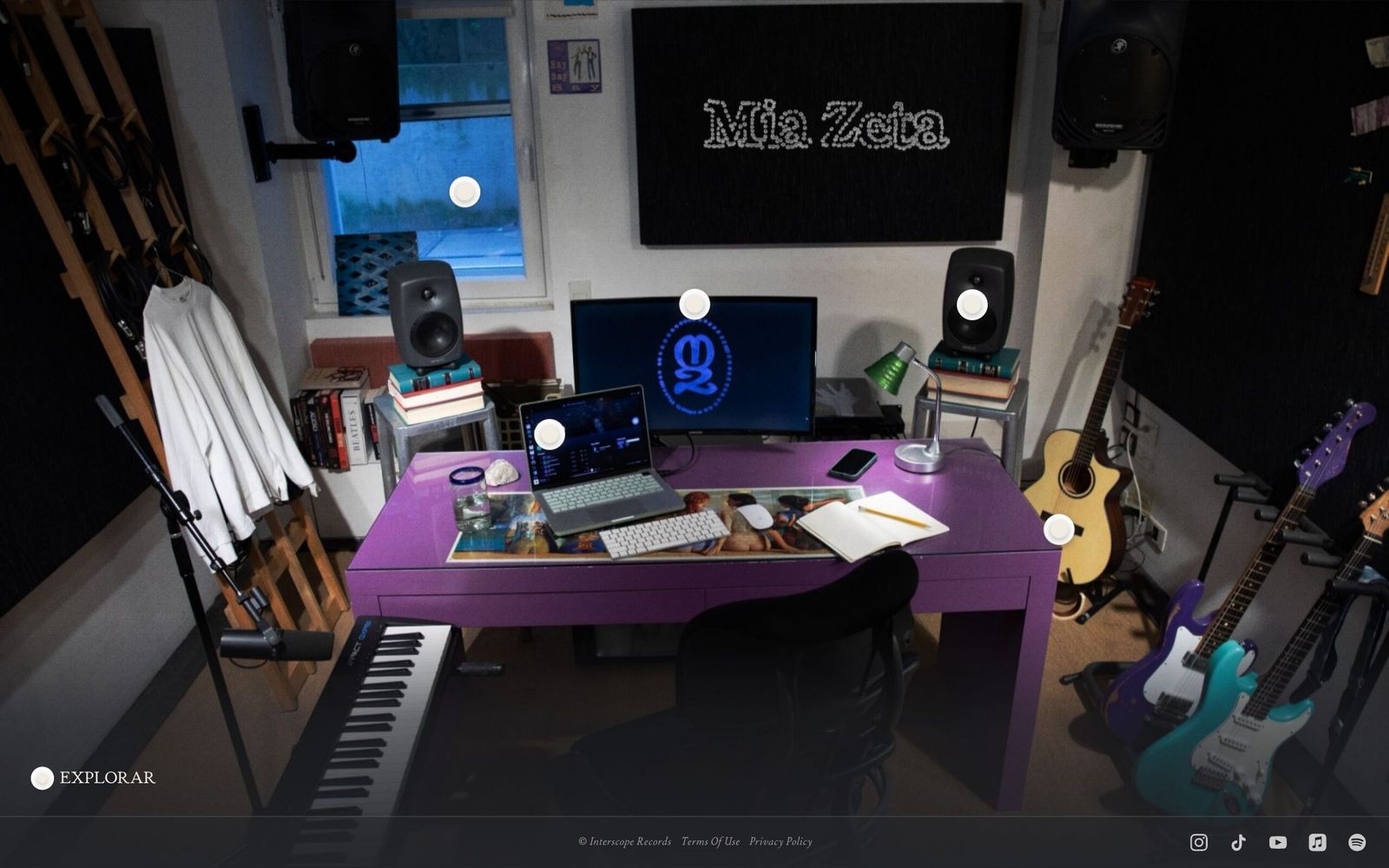
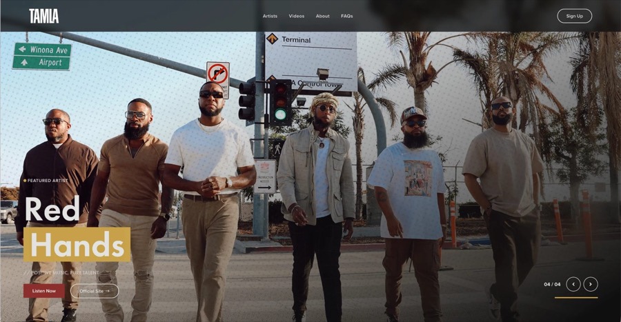
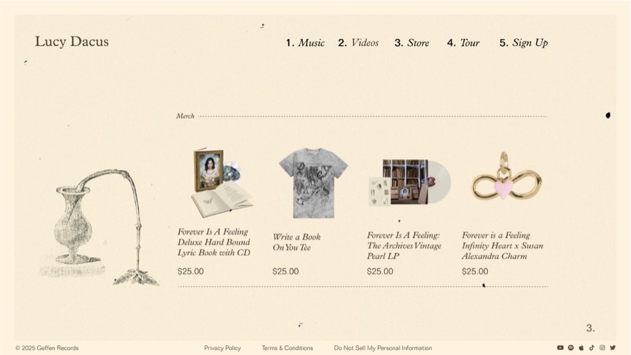
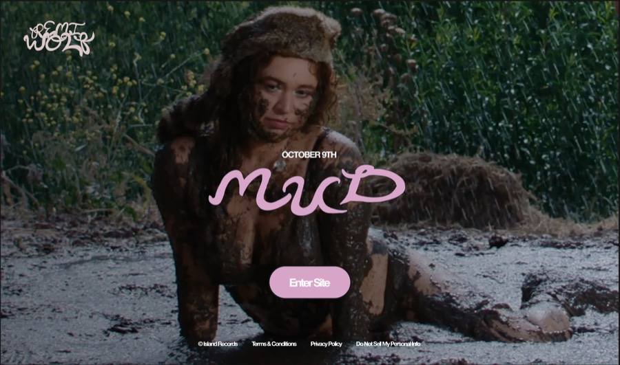
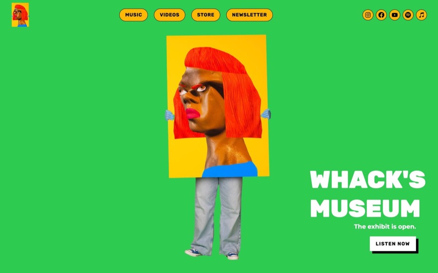
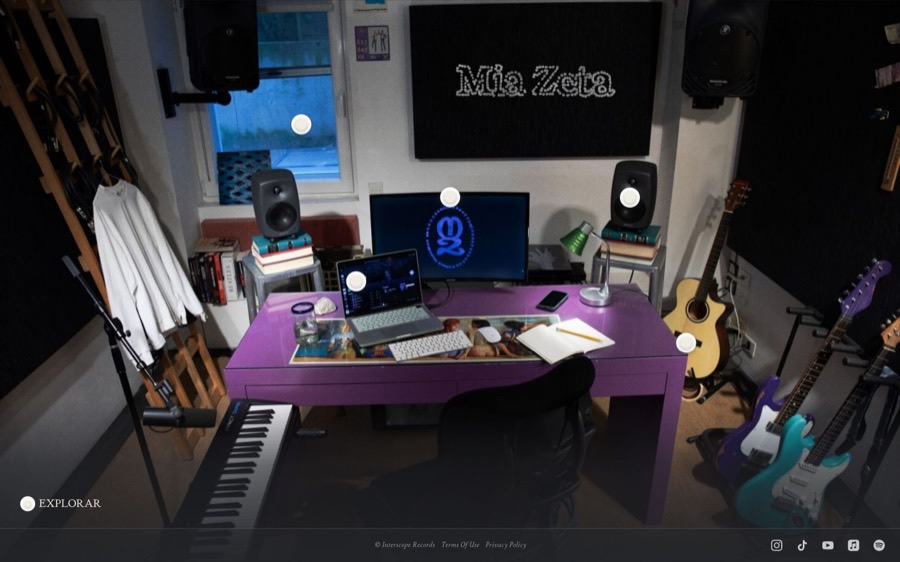
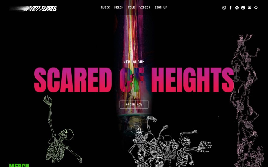
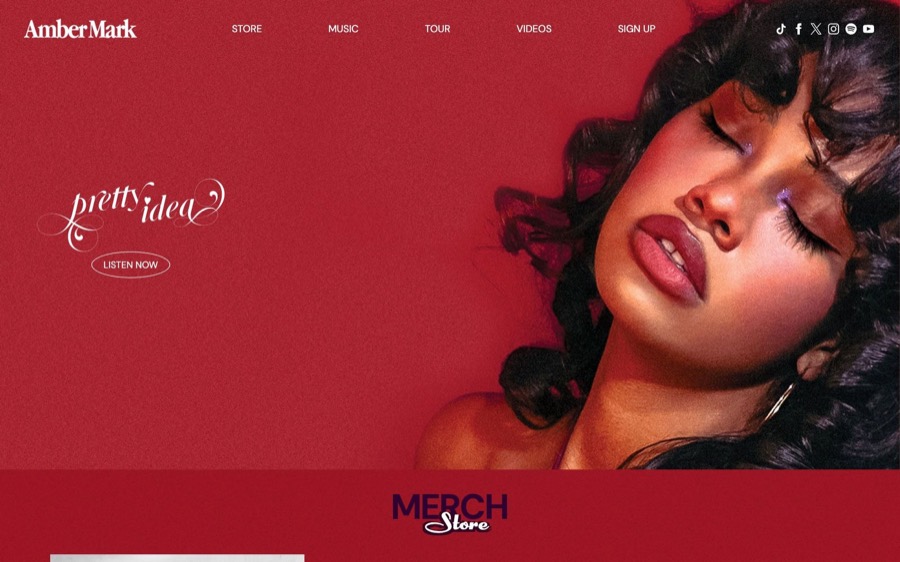
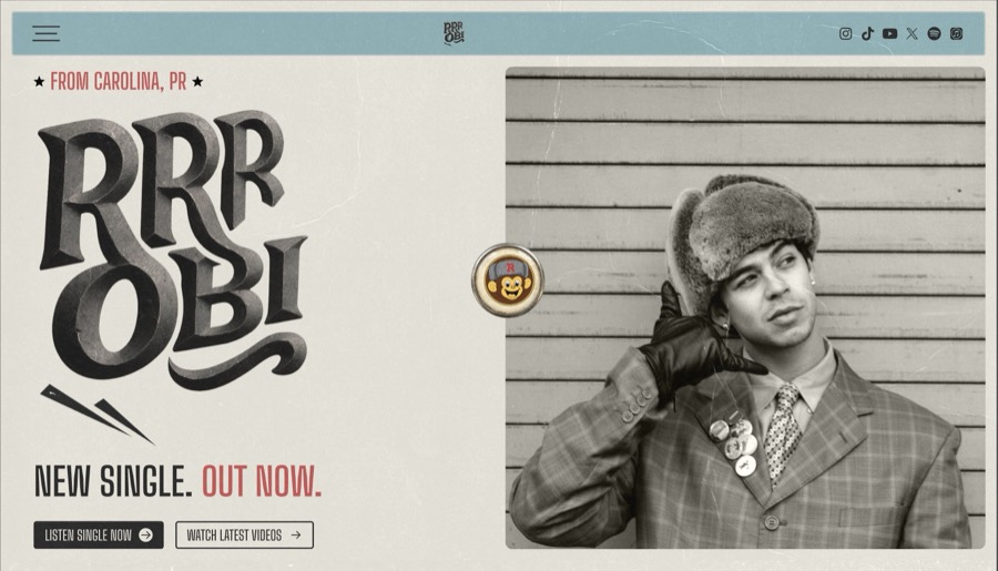
Twelve artist sites I designed for Universal Music Group, laid out on a slant: Tamla, Lucy Dacus, Remi Wolf, Tierra Whack, the Bee Gees, Coco Jones and more.

Most projects started with a logo, one photo, and a release date.

The fan comes first. I designed mobile first, because that’s where fans find a new release. In a few seconds they decide whether the site feels like the artist they love.

Same structure, a new face each time. Most artist sites needed the same five parts: hero, music, video, merch, and sign-up. I kept that structure steady so my time could go to art direction, and when a project allowed it, I set the structure aside and designed a new concept.

Faster where it was safe. I used AI only on the parts that repeat from site to site: page structure, components, and the design system. Production went from 16+ hours a site to about 3. The artist never went into an AI model: photos, artwork, names, and release details came from the label, and I worked with them by hand.

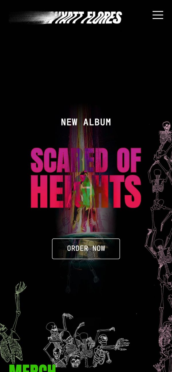
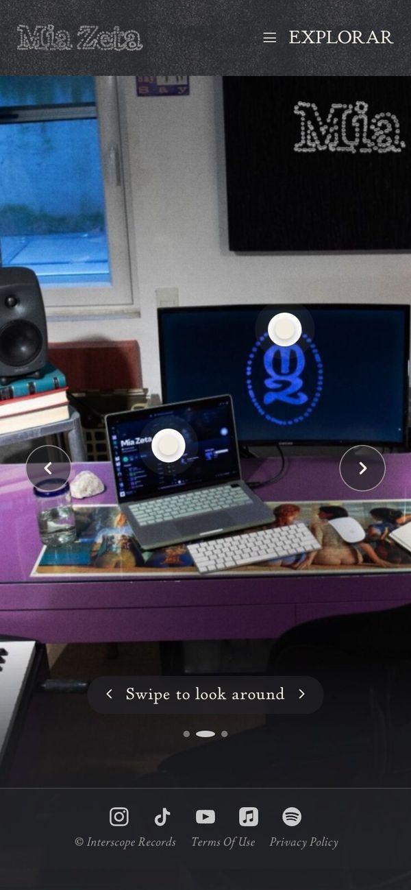
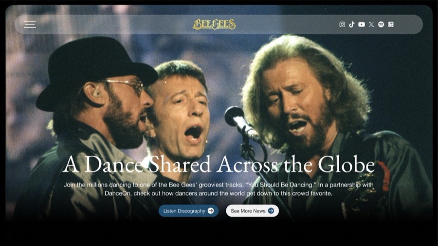
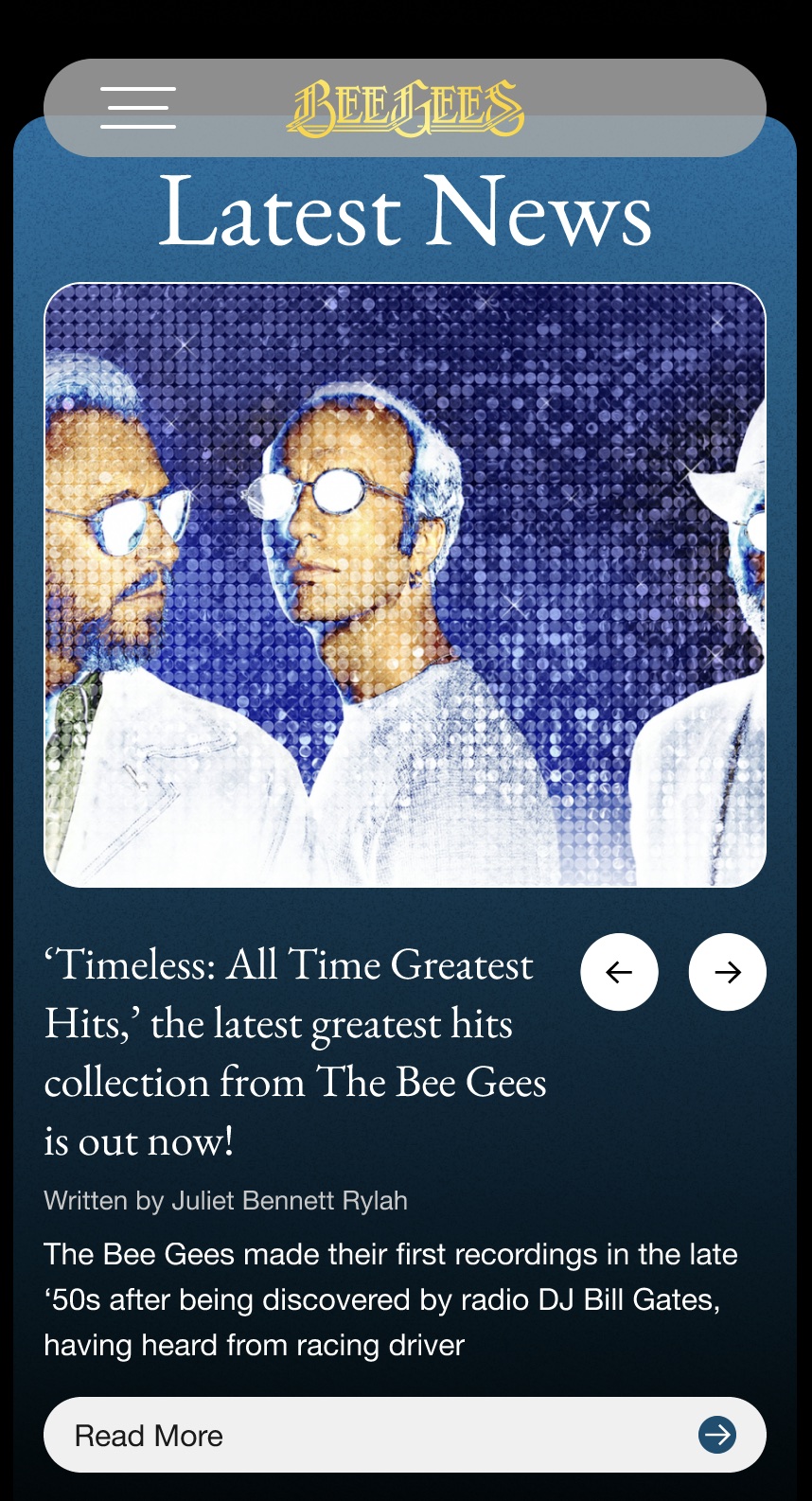
The Bee Gees site on a phone.
The Bee Gees
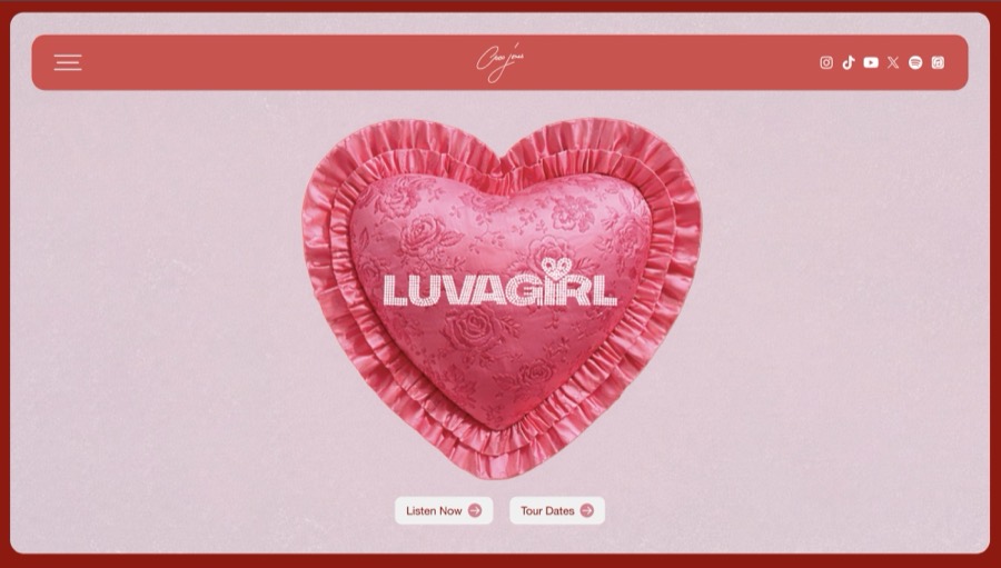
The Coco Jones site on a phone.
Coco Jones
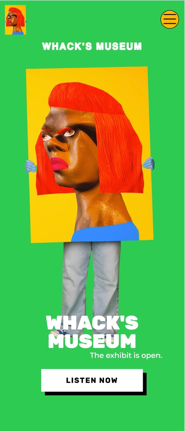
The Tierra Whack site on a phone.
Tierra Whack

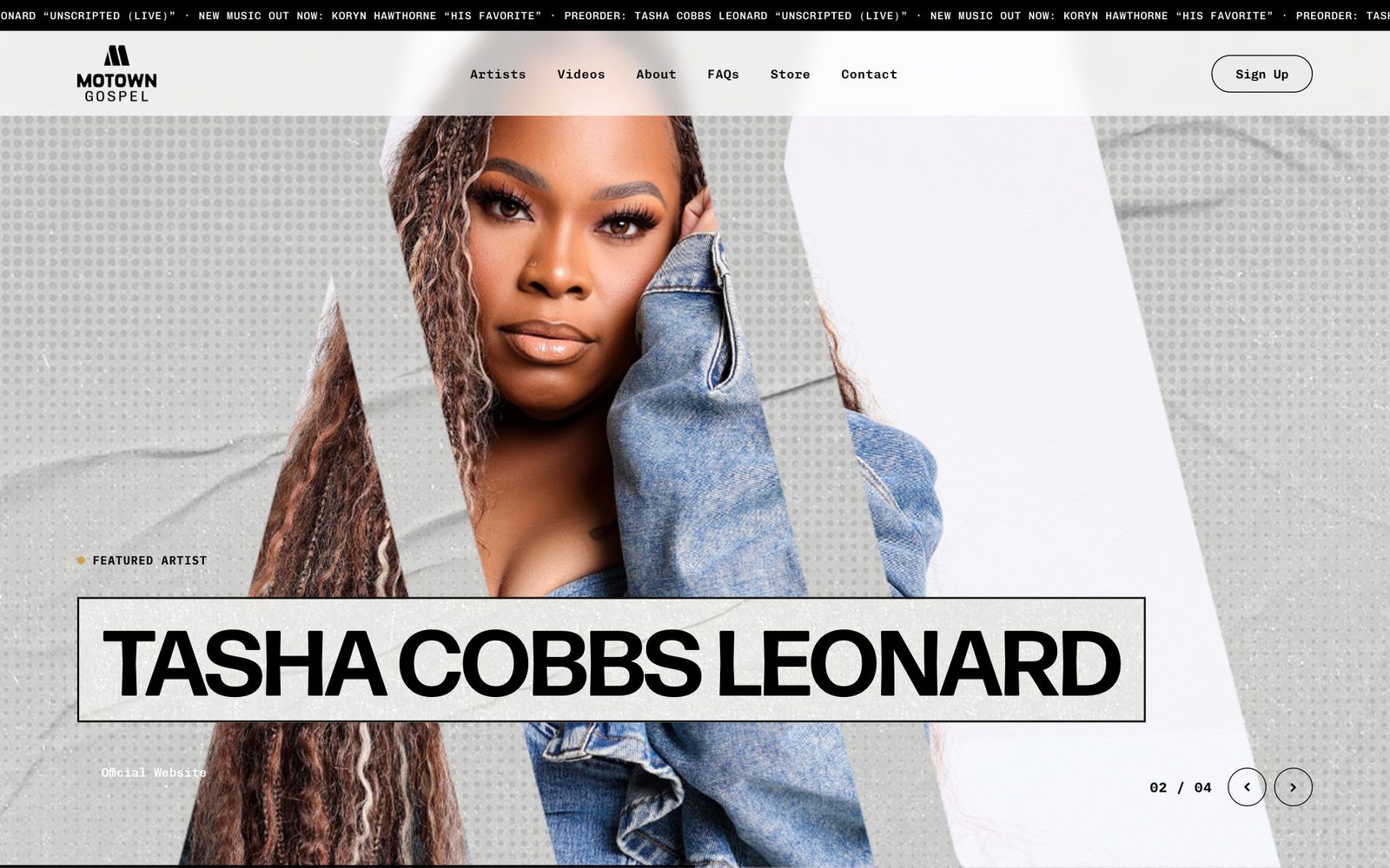
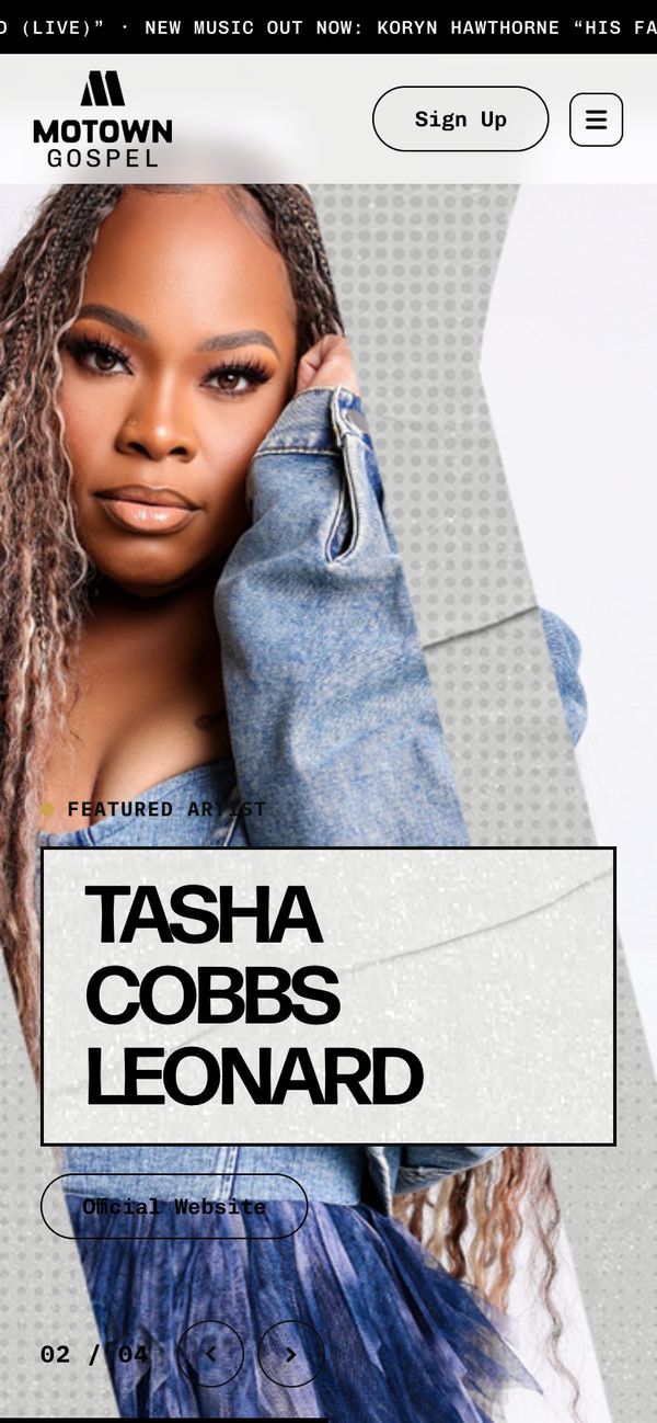
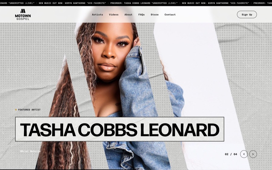
Tamla and Motown loved that every artist on the roster got their own moment, and that the site told the label’s story.

01The brief

A UMG project usually reached me with a logo, one photo, a release date, and sometimes a loose direction. Timelines changed with every artist. I was usually the only designer, so the site was mine from the first idea to developer handoff.

I designed for the fan. They want the new song, the tour date, or the merch drop, and they’re on a phone. If the page doesn’t feel like the artist, they leave before the layout gets a chance.
02Getting to know the artist

Before opening Figma, I spent time in the artist’s world: their social channels, past covers and videos, the references they share, and the culture around their music. The art direction came from there.

03Same structure, a new face each time

Most artist sites share the same page structure: hero, music, video, merch, and sign-up. Keeping it consistent meant fans always found what they came for, and it freed my time for the part that changes with each artist. When a project allowed it, I dropped the shared structure and designed a completely new site concept.

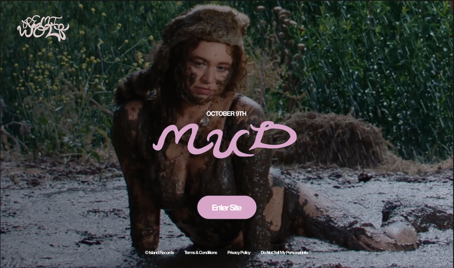
The Remi Wolf site, built on the shared structure.
Remi Wolf
Shared structure
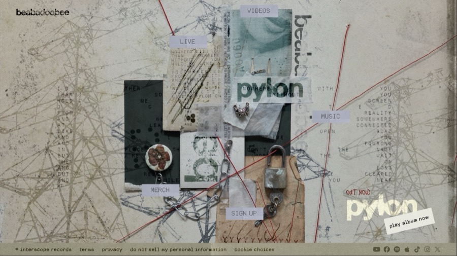
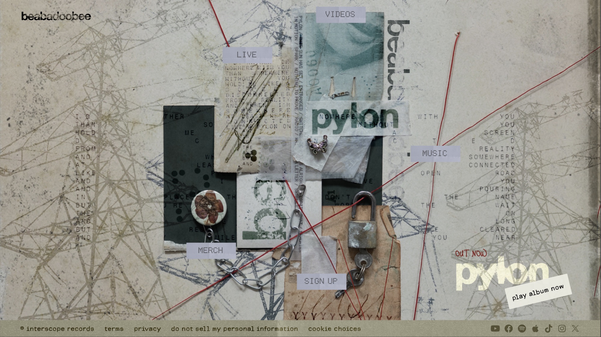
The beabadoobee site, a collage concept of its own.
beabadoobee
New concept

04Where AI helped, and where it never went

Before AI, most of my hours on a site went to production: building every section and every screen size by hand. I brought AI into that part only: page structure, the component system, and the design system every site shared. Production went from 16+ hours a site to about 3. The artist never went into an AI model. Photos, artwork, names, and release details came from the label, and I worked with them by hand, out of respect for the artists and the label. The hours I saved went to the creative direction (concept, mood, art direction), which I set and reviewed myself. That line is why I built Soundcheck: it turns the structure work into a Figma kit that works fully by hand, for teams that keep AI out entirely.

05Two artists, one template

The Bee Gees and Coco Jones sites start from the same template, one I built so it could be customized for different bands. For each artist we changed the type, the color palette, some of the sections, and the style of the components. Side by side they don’t look related, and that was the point. The structure stayed put so fans could find the music, and the art direction carried each artist.

07Reviews and handoff

I reviewed each site with the other Halo designers, then walked the developers, QA, and the delivery lead through it before the build. I applied feedback selectively, keeping the artist and the fan as the test.

08What changed

The teams at Tamla and Motown loved their label sites. What they valued most was that every artist on the roster got their own moment and their own contact, and that the site told the label’s story.

A label site is a room full of artists, and each one needed to feel welcome in it.

09The system I left ready

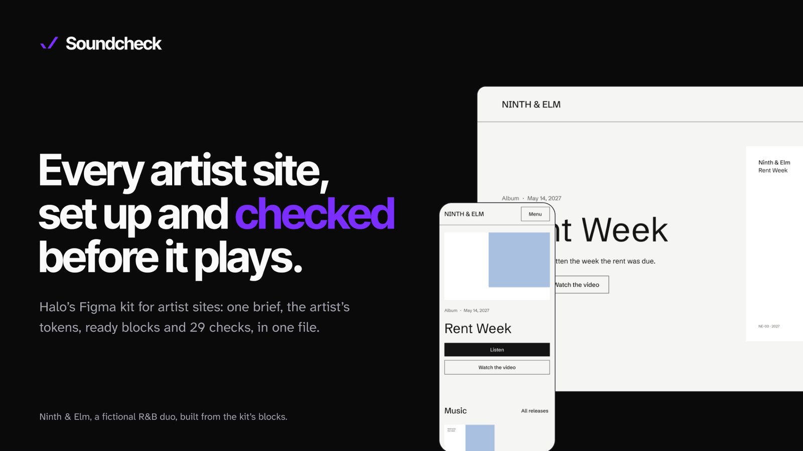
What I learned from these sites became Soundcheck, a Figma kit so every artist site starts with a clear direction and gets checked before it plays. It has its own case study.

See Soundcheck

Soundcheck cover: the kit's first page in Figma.

10What I took from it

Every artist is different, and every deadline is tight. UMG taught me to work fast without letting the design go generic.

It’s the job I want to keep doing for consumer products: someone opens the app for one thing, and in a few seconds it should feel made for them.

More work