Back to the table

TicketSocket website

25+ pages redesigned as one system, so a new page never starts from zero.

Client
TicketSocket, through Halo Media
Role
Product Designer
Time
About 5 months
Scope
Brand direction, a component system, 25+ pages
Pages
Campaign landing pages, product features, industry pages, case study templates
5 months
25+ pages
TicketSocket marketing pages I designed, laid out on a slant: finished pages, a template, the sitemap, industry pages and the exploration board.

TicketSocket’s site had grown one page at a time, and every new page meant starting over.

A new direction first. I proposed a few visual directions. We went with the most colorful one, and it kept TicketSocket’s blues so the brand still felt familiar.

Parts, not pages. Heroes, calls to action, content blocks, pricing, and case studies became components with layout rules. The team could reuse the templates without waiting on design.

25+ pages in about five months. Campaign landing pages, product features, pages for each industry, and case study templates, all built from the same parts.

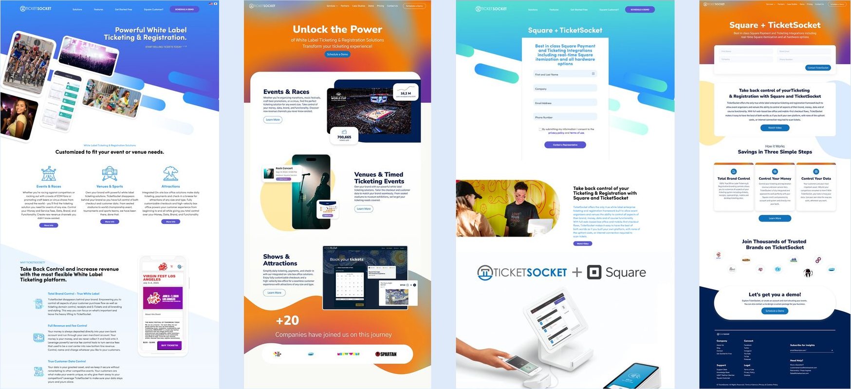
Four finished TicketSocket pages side by side, including the Square partnership page.

No metrics were shared with me. What I could see: new pages came together from parts that already existed, and every page looked like the same company.

01The starting point

TicketSocket sells ticketing and registration to event organizers, from races to venues. Its site had grown over the years, one page at a time. They didn’t share a visual language, the layouts weren’t built to lead anyone to a demo, and each new page took design time to build and was hard to keep up.

The brand also had to work for two audiences at once: big enterprise organizers and smaller ones. It needed to feel solid enough for the first and friendly enough for the second.
02A new direction

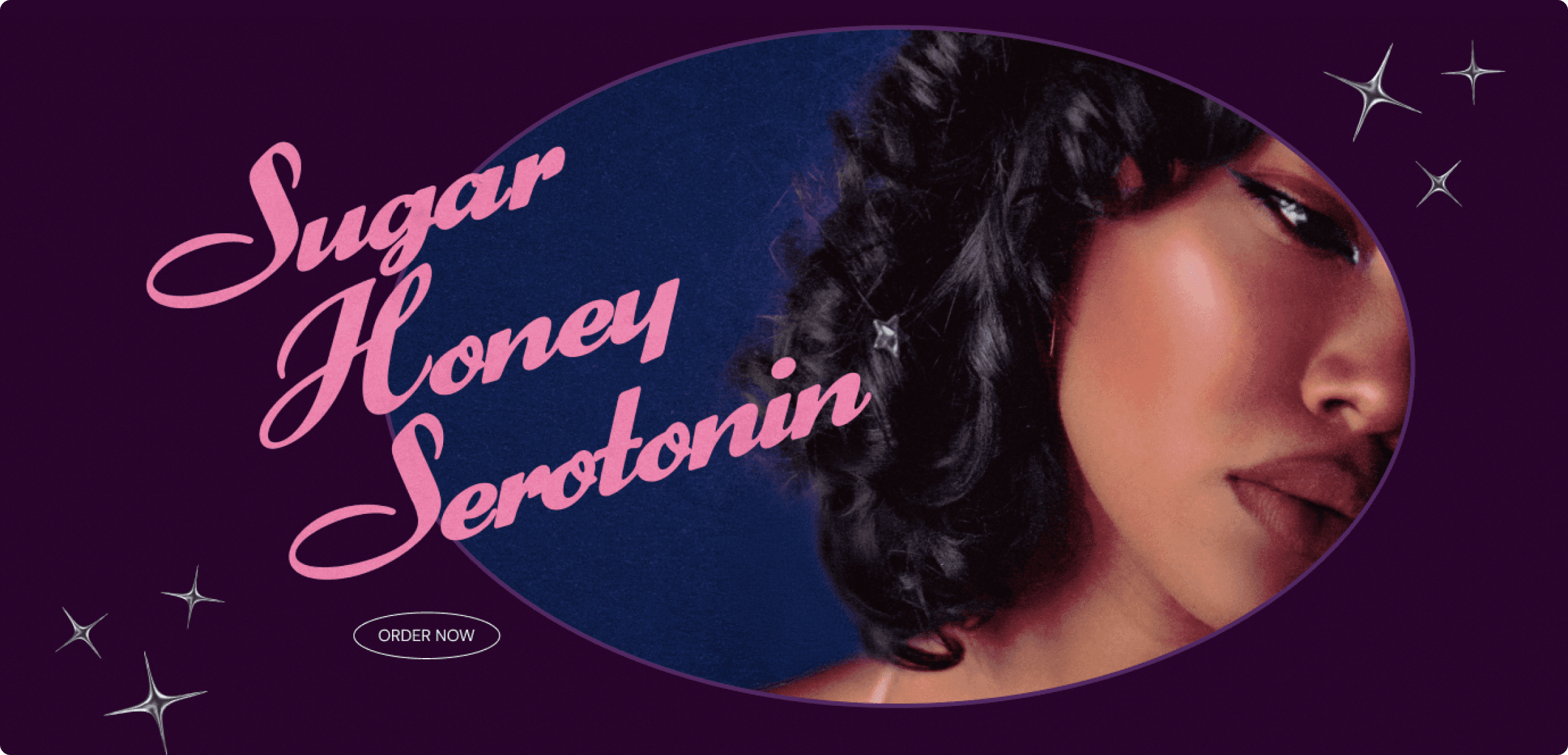
Before designing any page, I worked on how TicketSocket should look. I proposed a few directions in rounds, and the client chose the second one: more color, more modern, and flexible, with TicketSocket’s own blues kept in so people would still recognize it. We agreed on four words for it: modern, friendly, confident, and clearly B2B.

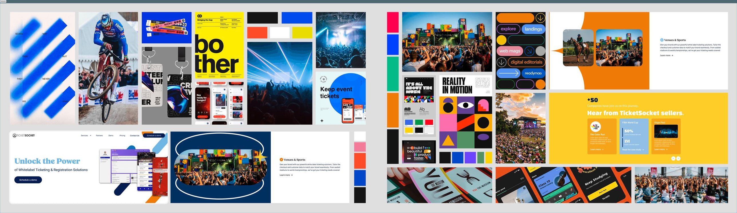
The exploration board: references, color, type, and first page sketches for the new direction.
Exploring the new direction

03Parts, not pages

With the direction set, I stopped designing pages one by one and designed the parts instead: heroes, calls to action, content blocks, pricing sections, and case studies. Layout rules kept every page consistent and still left room to change things for a campaign or an industry.

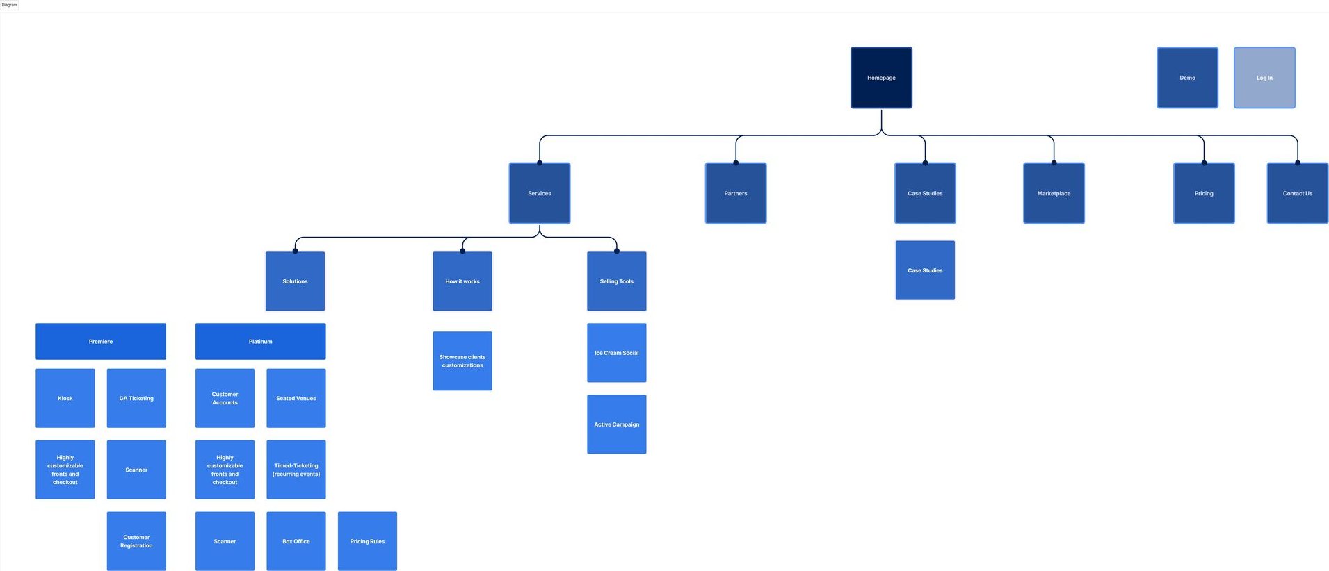
The sitemap for the new marketing site.
Sitemap
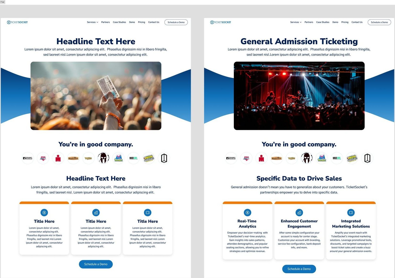
A page template with placeholder text next to the same template filled in for General Admission Ticketing.
One template, empty and filled in

0425+ pages

In about five months I designed more than 25 pages with that system: campaign landing pages, product feature pages, a page for each industry, and case study templates. I built it so the marketing leads could pick a template and make a new page on their own.

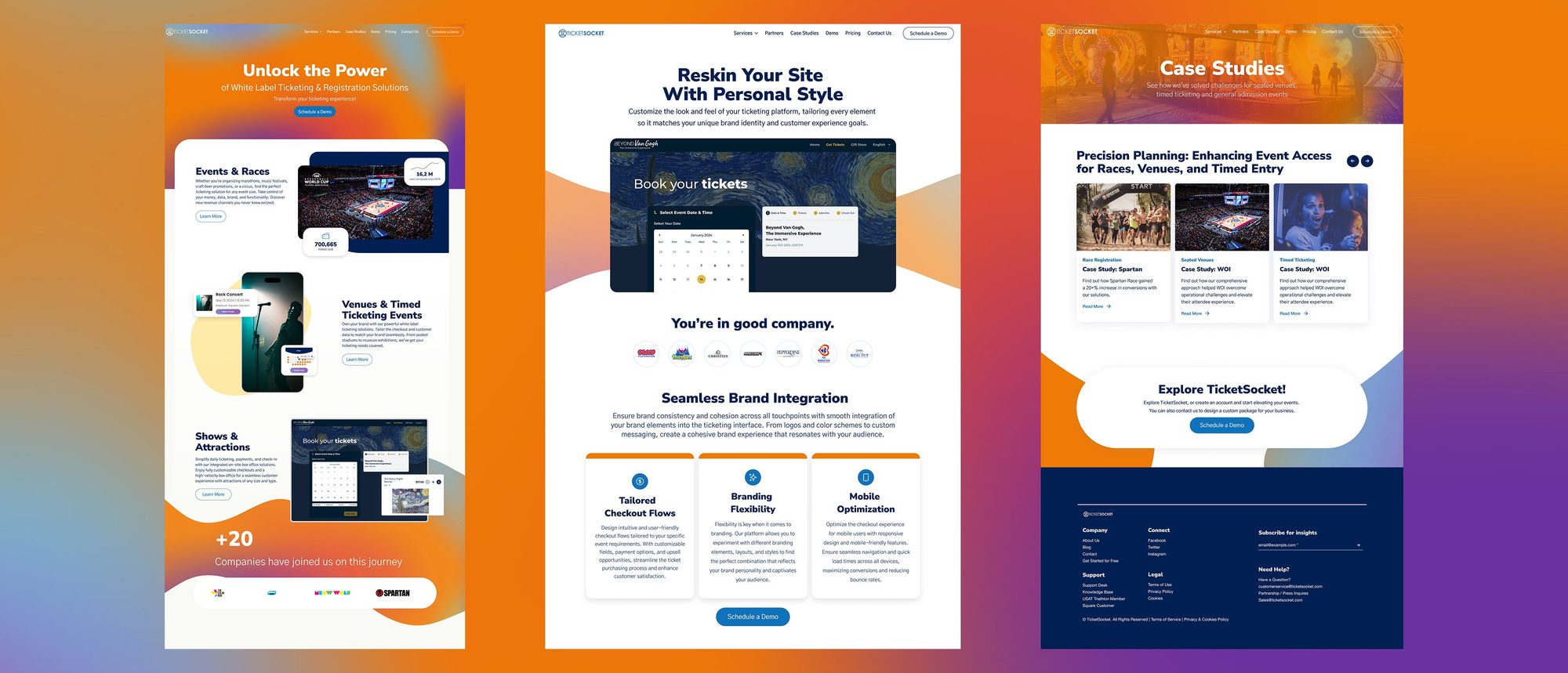
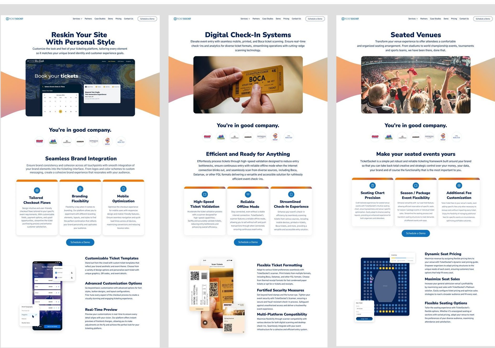
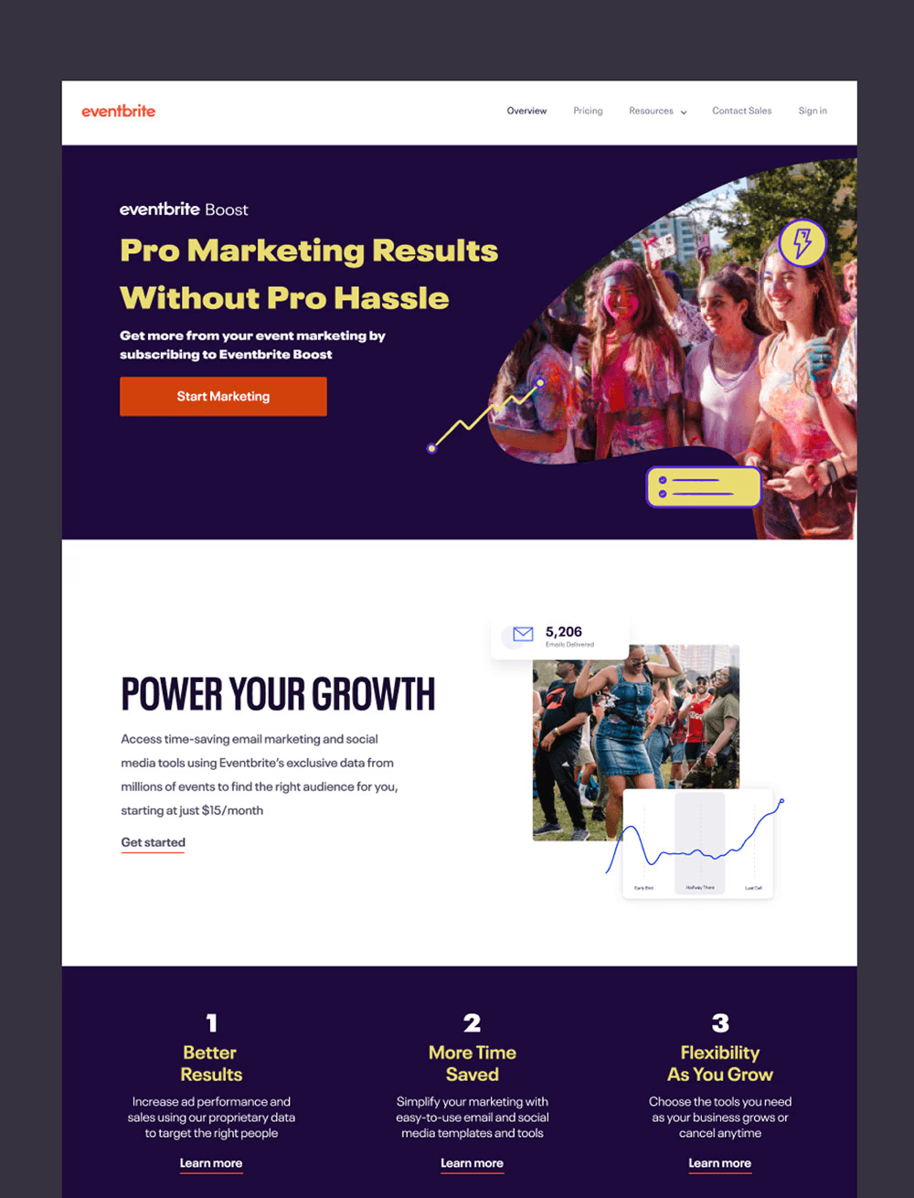
Three pages built from the same parts: site reskin, digital check-in, and seated venues.
Three pages, the same parts
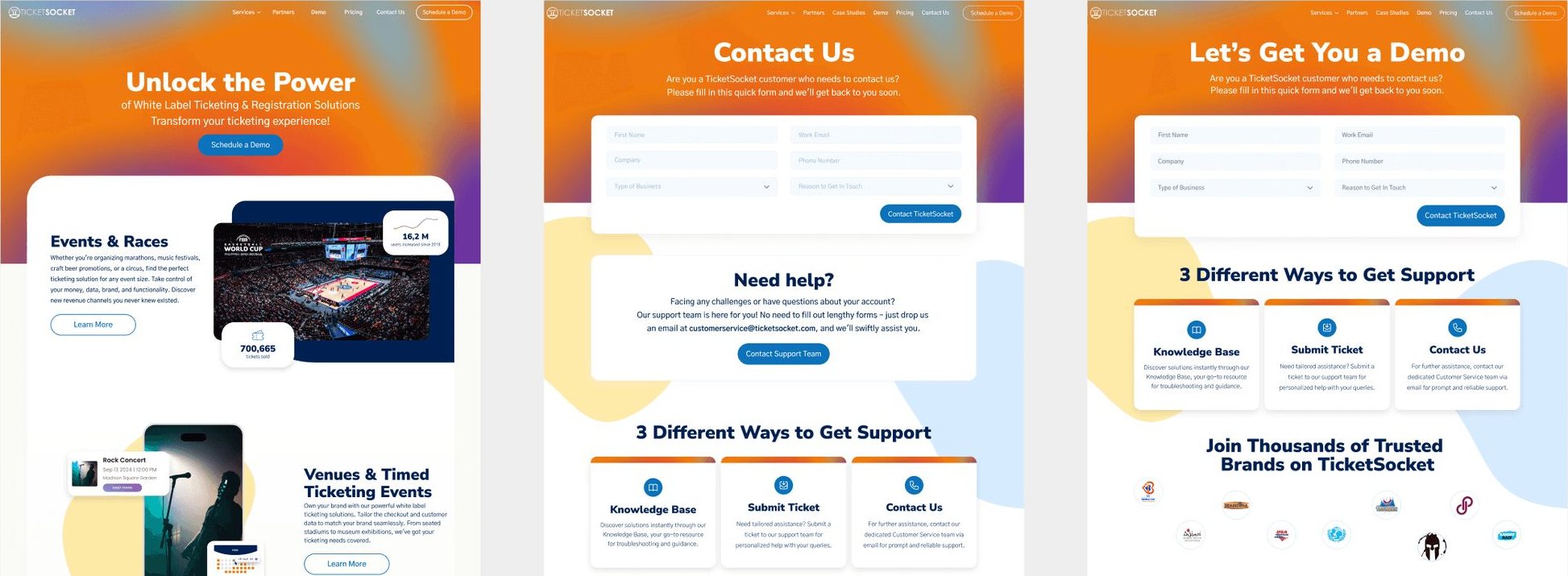
The home, Contact, and Demo pages.
Home, Contact, and Demo

05Built to explain, and to lead to a demo

Every page had two jobs: explain what TicketSocket does, and lead the organizer to a demo or a contact form. So the hierarchy is clear, the call to action sits in the same place on every page, and the sections fit any page type. A/B testing wasn’t in scope, so I leaned on conversion best practices for layout and copy.

06Reviews

I reviewed the work regularly with the client, the project manager, and the design manager. Most feedback was about visual polish, copy clarity, and conversion. It changed how some components behaved, but I kept the structure steady so the system wouldn’t pile up design debt.

07What changed

New pages came together from parts that already existed, and every page looked like the same company.

TicketSocket didn’t share metrics with us. The system kept up with new campaigns without new design work each time.

08What I took from it

This project changed how I work. I went from designing pages to designing the system behind them, and from taking direction to setting it.

Someone choosing a ticketing platform shouldn’t have to learn a new page every time they click. I want to keep designing that kind of calm for consumer products.

More work