Back to the table

Soundcheck

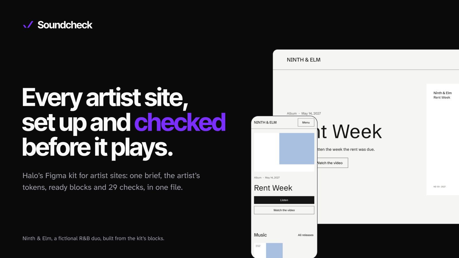
A Figma kit so every artist site starts with a clear direction, and gets checked before it plays.

Type
Design system for music artist sites, for any label
Role
Product Designer (research, system, checks, docs)
Time
About 2.5 weeks, Oct 16 to Nov 2, 2026
Status
Built and checked, not used on a real job yet
Scope
One Figma file, 11 pages: a site brief, tokens, a catalog of blocks, site sizes, 29 checks, a full example site
29 checks
11 pages
Soundcheck pages, laid out on a slant: the cover, the research, the six steps, the principles, a sample first screen and the Ninth & Elm example site.

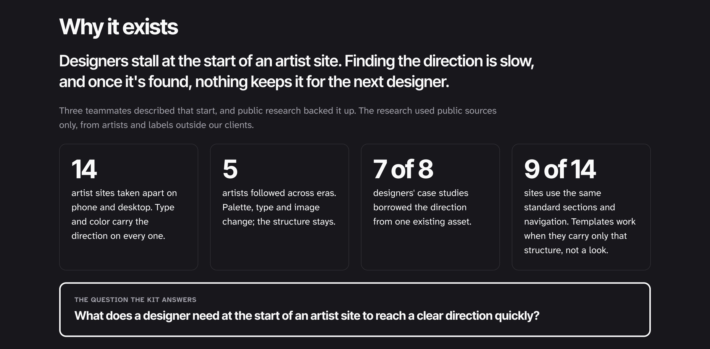
Designers stall at the start of an artist site. Finding the direction is slow, and once it’s found, nothing keeps it for the next designer.

A brief before any pixel. Every site starts with a one-page brief, about 15 minutes: what the client sent, what’s missing, and the direction. A blank is a question back to the client, never a guess.

Structure in the blocks, the look in the tokens. The artist’s colors and fonts are set once as variables and flow through every block. The same hero becomes any artist’s hero by switching modes.

29 checks before a client sees it. 23 musts and 6 shoulds, on phone and desktop. A failed must blocks the review.

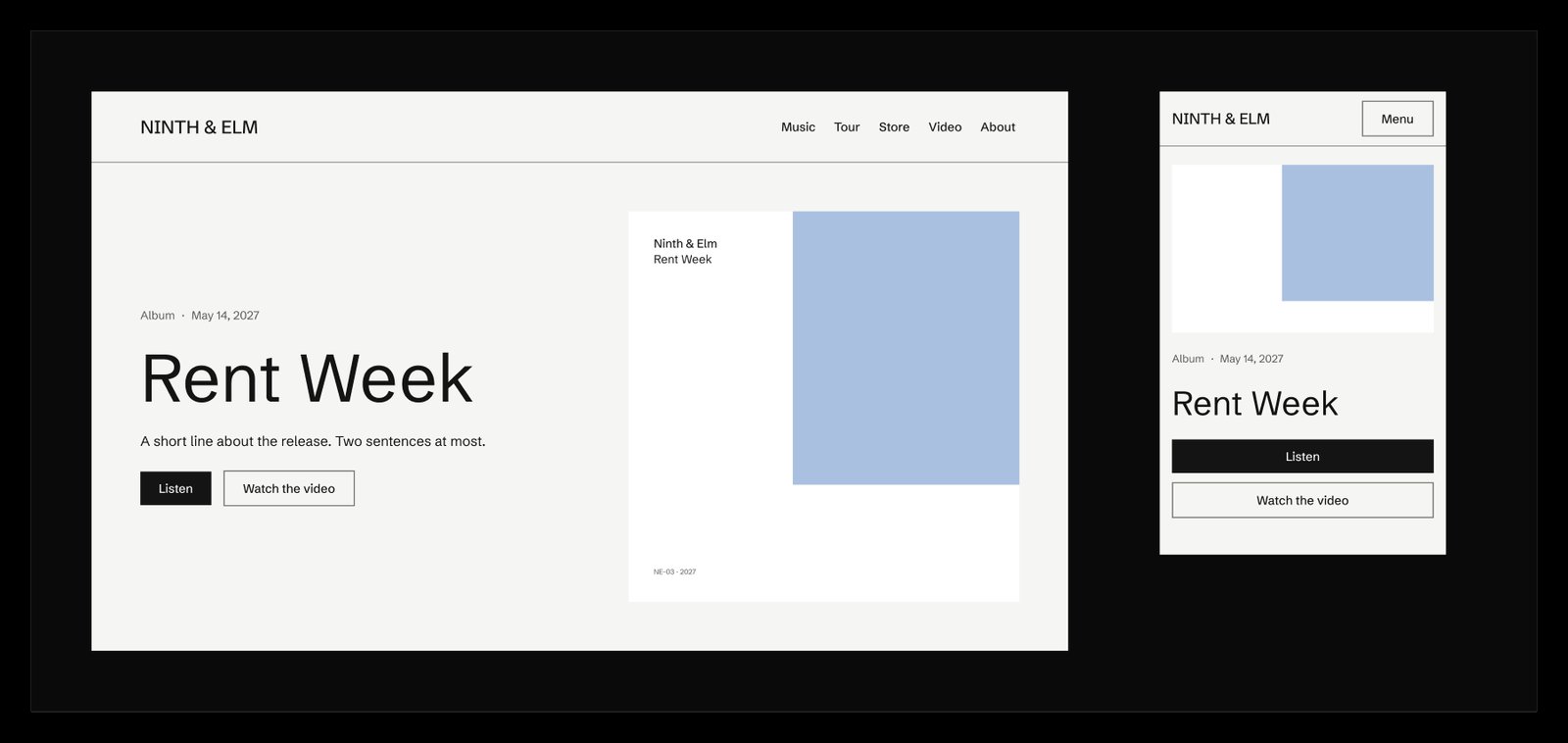
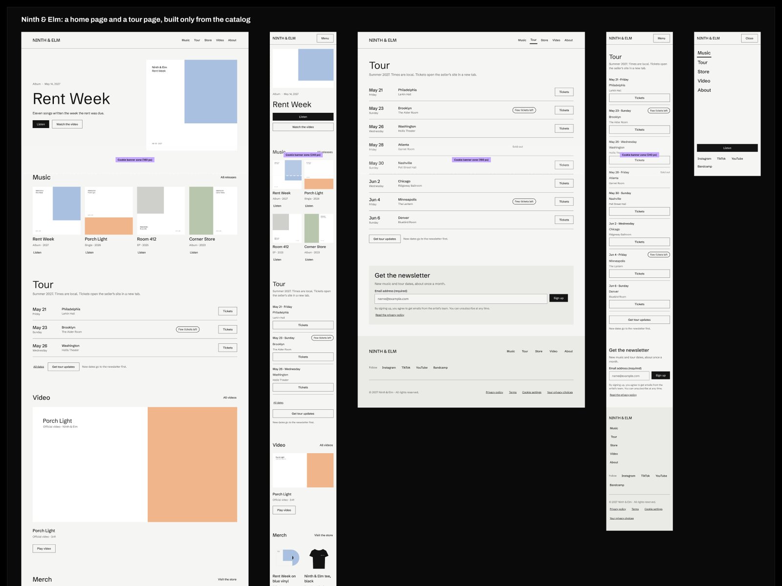
Ninth & Elm, a fictional R&B duo's site built only from the kit's blocks, on desktop and phone.

It’s built and checked, but my contract ended before a real job could test it. So no speed claims: nobody says it’s faster until a pilot measures it.

01Why it exists

Three teammates described the same start: a new artist site, a blank file, and a slow hunt for the direction. Once someone found it, it lived in their head. The question I set out to answer: what does a designer need at the start of an artist site to reach a clear direction quickly?

02What the research said

I used public sources only, from artists and labels outside our clients. I took apart 14 artist sites on phone and desktop, followed 5 artists across eras, and read designers’ case studies. Type and color carried the direction on every site. Across eras, palette, type and image changed while the structure stayed. 9 of the 14 sites used the same standard sections and navigation. So templates work when they carry only that structure, not a look.

The research in four numbers: 14 sites taken apart, 5 artists followed across eras, 7 of 8 case studies borrowed the direction from one asset, 9 of 14 sites share the same sections.

03Six steps, the same for every site

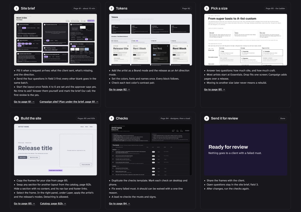
Fill the brief, set the tokens, pick a size, build from the catalog, run the checks, send it for review. Page 00 walks through them, and page 06 shows them done once for Ninth & Elm, a fictional R&B duo, from the manager’s first email to the review.

The Start here page: six cards, from the site brief to sending it for review.
Start here, the six steps

04Sizes that grow without a rebuild

Two questions set the size: how much site (one screen, one page, or pages over time) and how much craft (system only, one custom moment, or fully custom). Moving between sizes never means a rebuild: the smaller versions are copies with blocks turned off.

05Blocks that carry structure, not a look

Nav bar, hero, music, tour list, video, merch, sign-up and footer, each on phone and desktop. They look plain on purpose until an artist’s tokens are on. Designers can use them as they are, restyle them, or start from scratch. Detaching is feedback: a block that keeps getting detached is wrong, and we fix it or drop it.

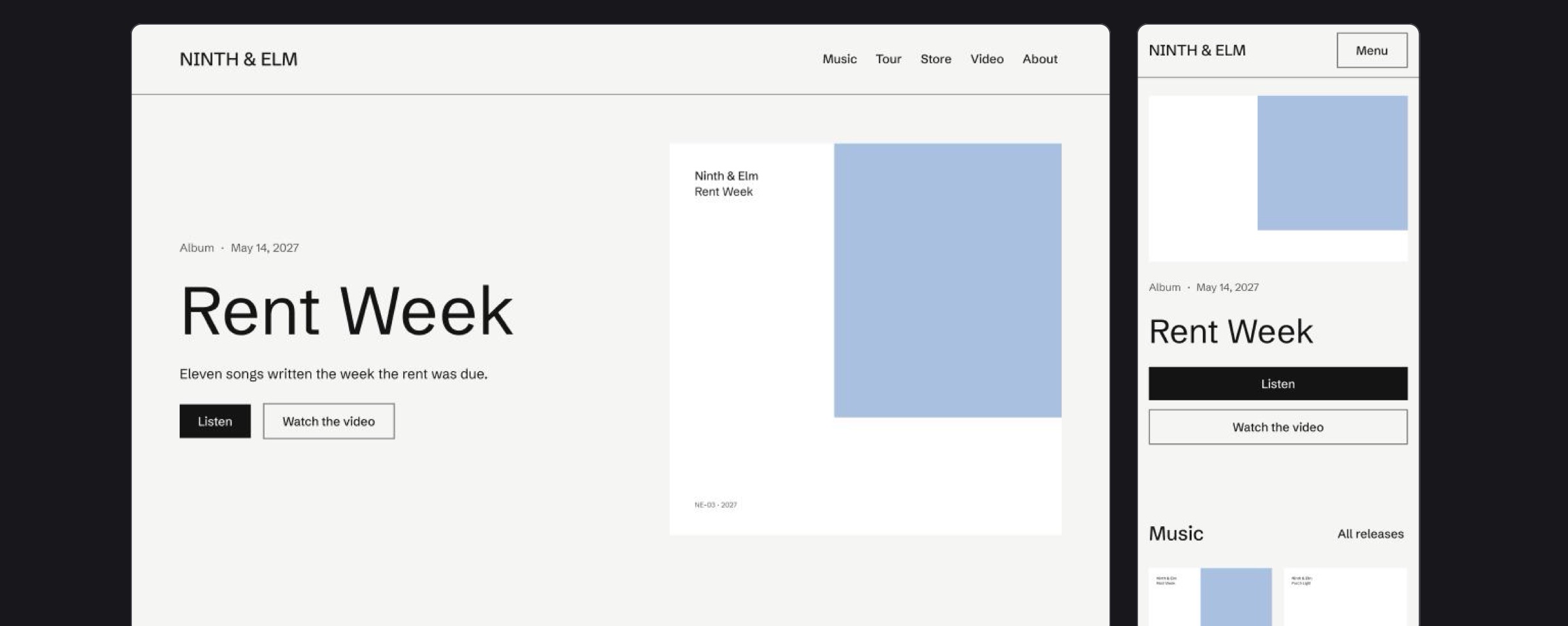
A sample first screen built with Soundcheck, desktop and phone.
A sample first screen
An example site assembled from Soundcheck blocks, at several sizes.
A site built from the blocks

06Checks that govern the outcome, not the method

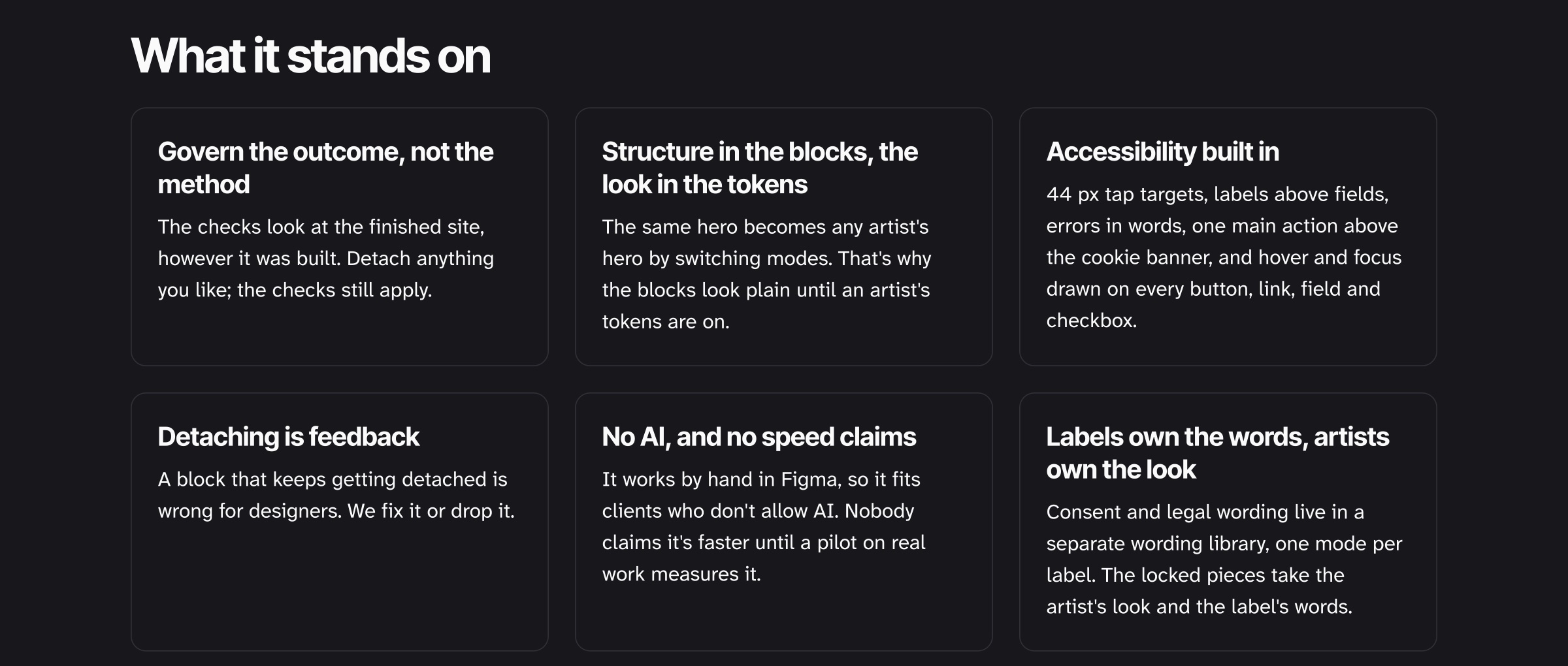
29 checks look at the finished site, however it was built: 44 px tap targets, labels above fields, errors in words, one main action above the cookie banner, and hover and focus drawn on every control. The designer runs them, then a lead signs. Ninth & Elm passes 28 of 29, with one held for later and said plainly.

It works by hand in Figma, so it fits clients who don’t allow AI. Labels own the legal and consent wording in a separate library; artists own the look.

What the kit stands on, six principles: govern the outcome, structure in blocks and look in tokens, accessibility built in, detaching is feedback, no AI and no speed claims, labels own the words.
What it stands on

08What’s still open

Nobody outside the project has used it yet. Next would be a pilot on one real request, timed against how the team works today. Until then, the brief’s 15 minutes is a target, not a measurement.

More work