Back to the table

Relay

A handoff tool that gives the developer and QA a seat at the table, and says on every line how far to trust it.

Type
Product exercise, from a written brief
Role
Product Designer (research, flows, brand, UI, built in code)
Time
About 4 weeks, fall 2026
Scope
7 screens and every state the brief names, a brand from zero, a working app
Built with
Next.js, Tailwind, shadcn/ui, with an AI coding workspace; I made the calls
2026
7 screens
Relay screens, laid out on a slant: screen detail, the feature flow, status marks, the read view on desktop and phone, Questions and the public page.

A designer hands over a checkout that runs in the browser. What the code can’t say is what it’s faking: made-up products, a “card declined” screen behind a hand-flipped switch, a promo field that accepts anything.

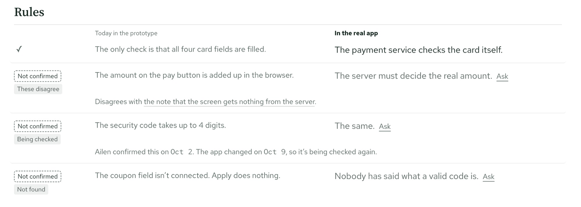
Every line has a status. Relay reads the built app and drafts the handoff. Each note says whether it’s a draft, checked, changed, or made up. Relay drafts, the designer decides.

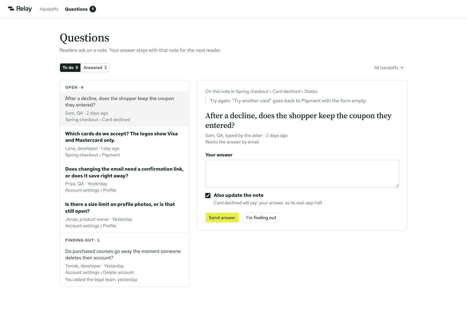
Written for the person who has to finish it. The developer sees what each screen needs from the back end. QA sees the intended behavior, not the prototype’s shortcuts. A reader asks a question on the note itself, and the answer stays for the next person.

Built, not drawn. I designed it as a working app: research, flows, a brand, and seven screens in code.
Relay's Questions screen: each reader question quotes the note it is pinned to, and the designer answers it.

It never met real users; it was an exercise. What I can show: all 39 states the brief asked for, built and clickable, and two rounds of design critique that changed the screen detail.

01The brief

No brand, no logo, no product, only a problem: the front end is no longer the hard part to hand over, because it’s already built. What doesn’t travel with it is everything the code is pretending about. So the developer guesses or asks, QA tests the fake behavior as if it were the spec, and the designer answers the same question four times.

02Listening first

Before any screen, I did a teardown of the tools that solve part of this (Figma Dev Mode, Zeplin, Storybook, Loom and Notion), read 28 public voices from developers and designers, and ran a hand test on 2 real apps: I wrote the handoff myself, to see what a person actually needs to write down.

03One idea: every claim has a status

I explored a few directions and picked B: every line in the handoff says how far to trust it. A draft looks like a draft, and a handoff can’t be shared with unconfirmed parts hidden. That rule came straight from the brief’s worst failure: a wrong draft that looks official.

The status marks in an earlier version, where a draft and a checked note shared one gray.
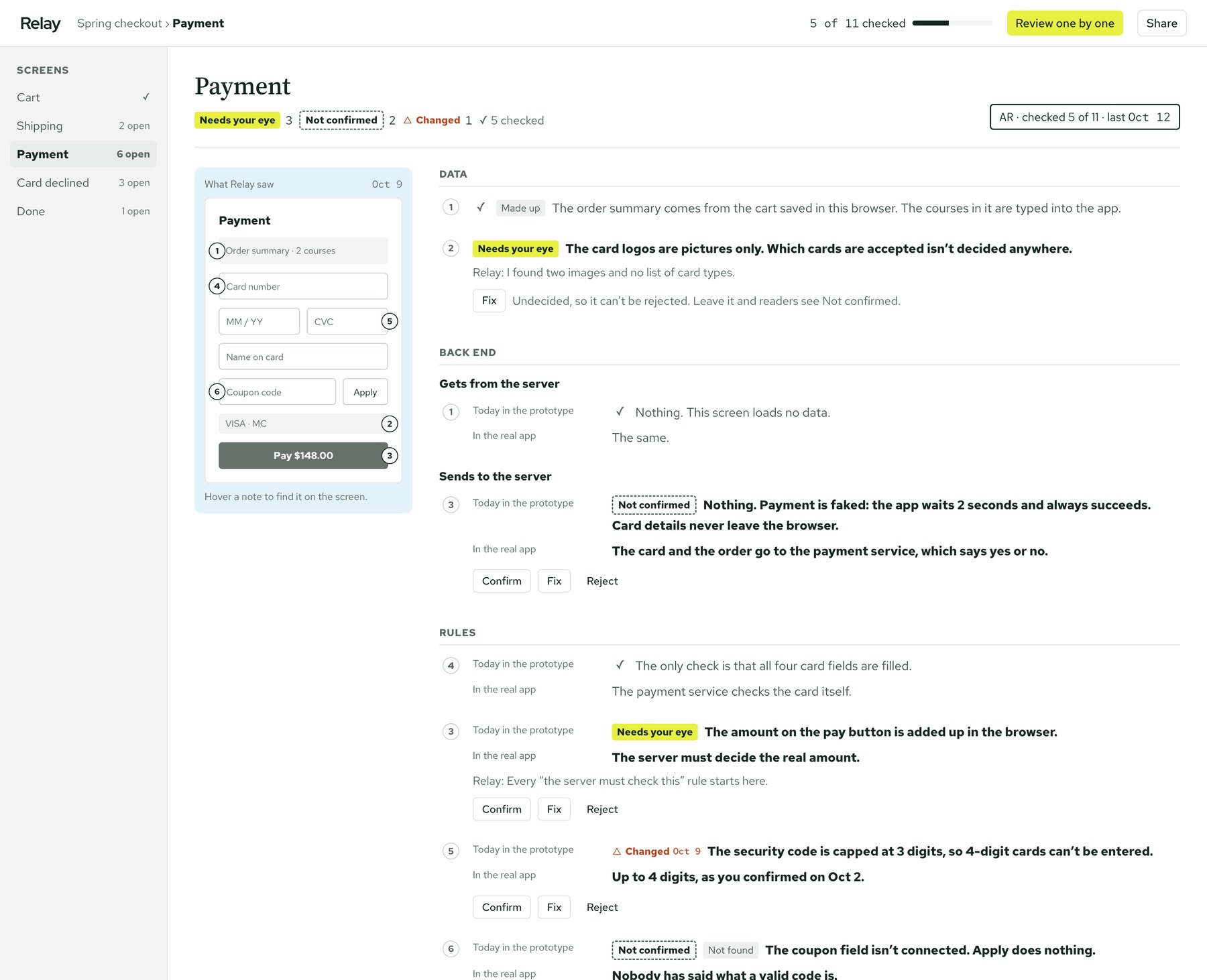
Before: a draft and a checked note looked alike
The final status marks: each pill's edge, dashed or solid, tells the status apart even without color.
After: the edge tells the status, even without color

04The flow as a real map

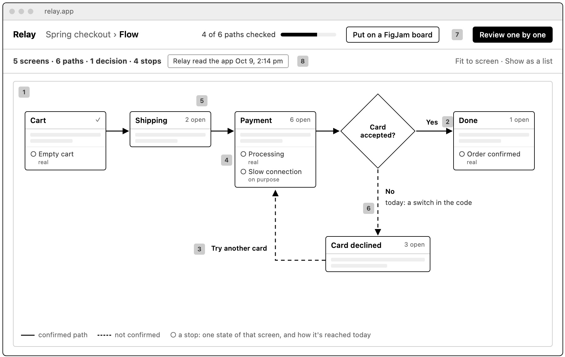
The feature as a flowchart: screens joined by paths, a branch at every decision, and each state as a stop with how the prototype reaches it today. Card declined loops back to payment. A dashed path means nobody has confirmed it yet.

Relay's feature flow for a checkout: screens joined by paths, with Card declined looping back to Payment.
A checkout’s flow

05A voice like a careful colleague

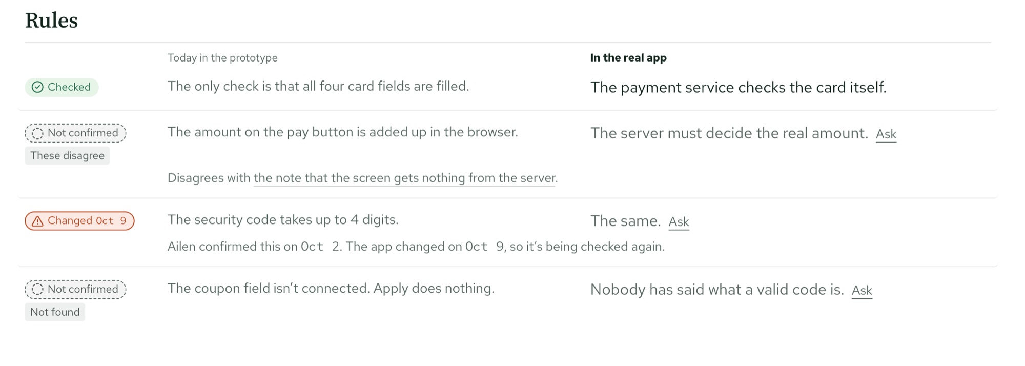
Relay writes like someone leaving notes on your work. It names the gap (“Nobody has said what a valid code is”), says what’s settled before what’s open, and lets a name do the reassuring (“Checked by Ailen, Oct 12”).

06Every state, a click away

I built the seven screens the brief asked for in code, with every state it named: empty, loading, error, an app with two hundred screens, a page behind a login. I checked the build against the brief: all 39 states that applied are there, and nothing it asked for is missing.

Screen detail before two critique rounds.
Before two rounds of critique
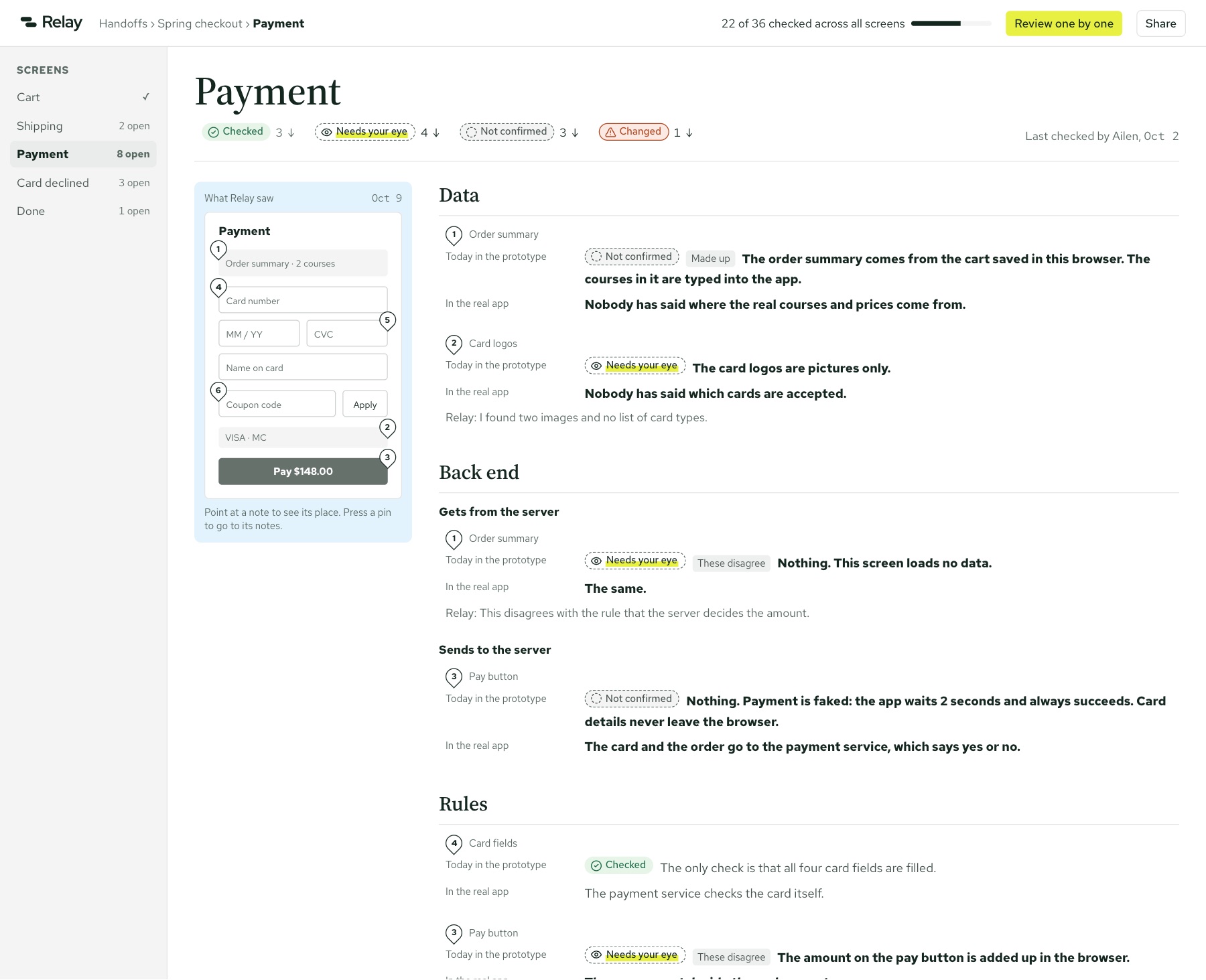
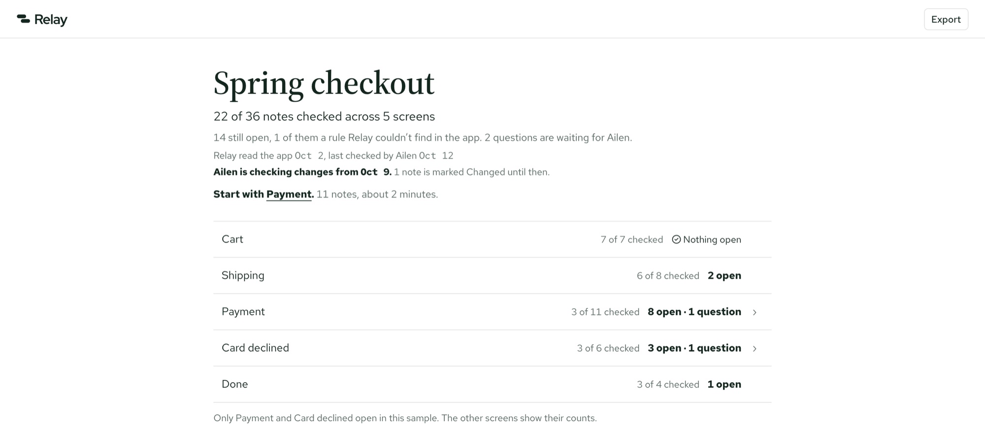
Screen detail after two critique rounds, with a count for the whole handoff and who checked it last.
After: a count for the whole handoff and who checked it last

07Room for people who lose their place

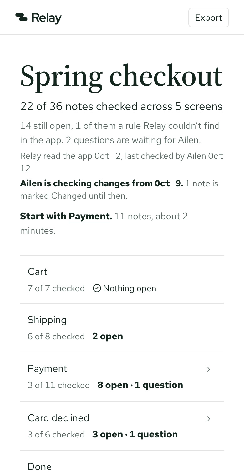
I added one more layer: five rules every reader screen follows, for people whose attention breaks easily. Where you left off, what changed, what’s still open, in short, before the detail. I know that reader well.

The read view on desktop, opening with a short Start here summary before the detail.
The read view, on desktop
The same read view on a phone.
And on a phone, where questions get asked

08What I’d do next

Relay never met real readers. Next I’d test the read view with two or three developers who lose their place in long docs, and let the numbers on the Readers screen come from a real server instead of examples.

More work